

Highway Legacy
Magazine

The Magazine
Highway Legacy is a Canadian trucking industry magazine that blends editorial storytelling with strong visual design. The publication features in-depth articles, industry news, and engaging photography, all structured through thoughtful layout, typography, and hierarchy. This project demonstrates skills in publication design, grid systems, branding consistency, and editorial layout while creating a visually compelling reading experience tailored to a specialized audience.


Highway Legacy Magazine App
Case Study
1
Overview
This case study explores the design of a mobile magazine app created in Figma, developed to bring Highway Legacy—a magazine focused on the trucking industry—into a digital format.
The goal of this project was to design an accessible and engaging platform where users in the trucking industry could easily read, browse, and interact with magazine content on their mobile devices. The project focused on translating a traditionally print-based experience into a modern, user-friendly digital interface.

2
Problem
Truck drivers and professionals in the trucking industry often rely on print magazines like Highway Legacy for news, stories, and industry updates. However, there are a few problems:
-
Limited accessibility while on the road
-
Difficulty storing and carrying multiple magazine issues
-
Lack of interactive or searchable content
Design Challenge:
How might we create a digital platform that allows trucking professionals to easily access and read Highway Legacy magazines anytime, while maintaining a familiar and enjoyable reading experience?

3
User Research
To better understand the target audience, research focused on the needs and behaviours of individuals in the trucking industry.
Key insights revealed that users prefer simple, distraction-free interfaces due to long working hours, rely on quick navigation during short breaks, benefit from large text and clear layouts in varying lighting conditions, and highly value offline access due to inconsistent connectivity on the road.


4
User Flow
Based on research findings, a streamlined user flow was created to minimize friction and support quick access to content.
The flow prioritizes quick entry into reading, reducing unnecessary steps and ensuring users can access content efficiently during short breaks.
5
Wireframes
The use of wireframes helps to map out where certain elements will be in the final product, make quick changes to try different layouts and test our user experience. After the final wireframes are completed changes in the next steps are minimal or none. These wireframes layout a foundation for the next steps In development.

7
User Testing
Basic usability testing was conducted by sharing the prototype with a small group of users to evaluate navigation, readability, and overall ease of accessing magazine content. Findings showed that users appreciated the simple, intuitive navigation and clear reading experience, while also suggesting improvements such as adding bookmarking features and offline download capabilities.
6
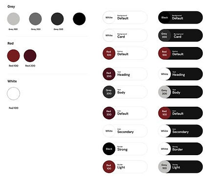
UI Kits
A consistent UI kit was developed to maintain visual cohesion across the app, featuring typography optimized for readability, a neutral high-contrast color palette, intuitive buttons and navigation, and card-based layouts for magazine previews. Guided by clarity, consistency, accessibility, and familiarity, the system ensured content was easy to read and navigate while streamlining the design process across all screens.

8
Reflection
This project successfully translated a traditional print magazine into a digital experience tailored to the needs of trucking professionals. One of the biggest takeaways was the importance of designing for real-world usage contexts—such as limited time, varying environments, and connectivity challenges.